Carved, Hewn, Encoded
Matter of Sorts conceived and drew new fonts under the direction of Studio Ongarato with the input of chief executive Lisa Havilah and artistic associate Agatha Gothe-Snape. The resulting three custom typefaces – Powerhouse Cambium, Powerhouse Punctum and Powerhouse Filar – found their roots in the vast array of industrial artefacts in the substantial Powerhouse Collection. They draw upon various objects across numerous industries, traversing disparate technologies and time, each contributing a distinct texture to a new typographic palette. They can be understood as a reflection of three kinds of materiality evident in the history of type: metal, wood and the digital, or perhaps through the specific gestures required to bring these letterforms to life: carved, hewn and encoded. This is the recounting of their development.
Powerhouse Cambium
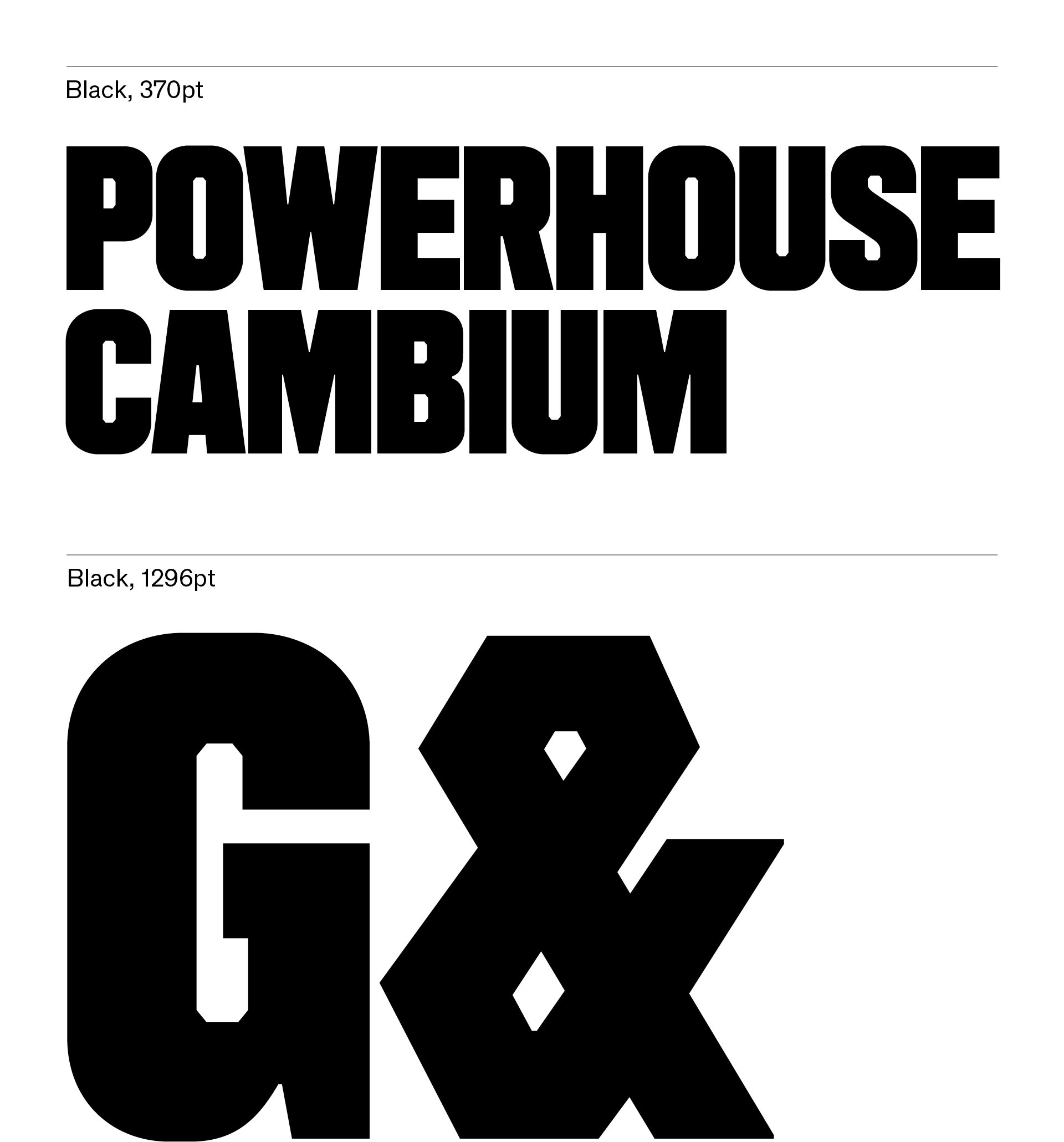
The primary typeface, used to render the logotype, required a substantial presence and some notion of visual distinction. There were various candidates from the collection that suited this brief. Studio Ongarato started the process with some sketches based on a font by the influential US designer Morris Fuller Benton. It features rectangular counterforms – a dissonant detail at odds with its round exterior contours – and a rationalised, simplified construction.
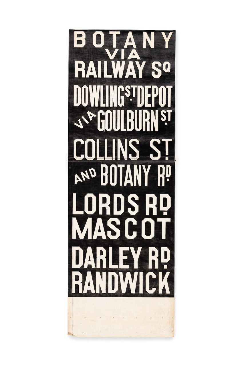
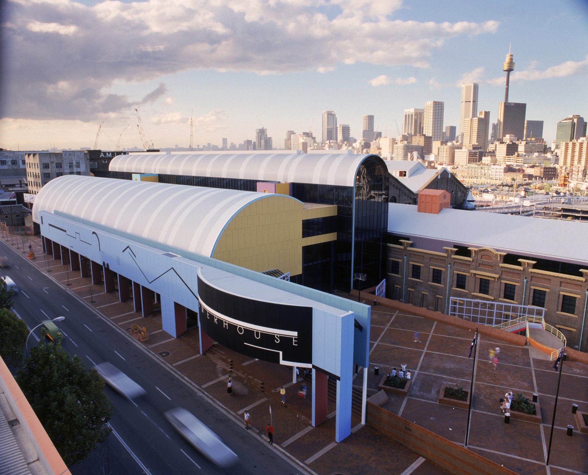
The first points of reference that stood out to me on a visit to Powerhouse Ultimo, housed in a former coal-fired power station that was used to power Sydney’s trams, were the iconic former Central Station destination rolls: boards which displayed the station names, departure times and platform numbers. The lettering on these destination rolls also played with a form/counterform tension but reversed the logic of Raleigh Gothic: loped or chamfered contours wrapped around smooth rounded interiors. Their utilitarian forms featured the kinds of idiosyncrasies from an engineer’s eye: industrious, assured and with a certain mechanical charm.
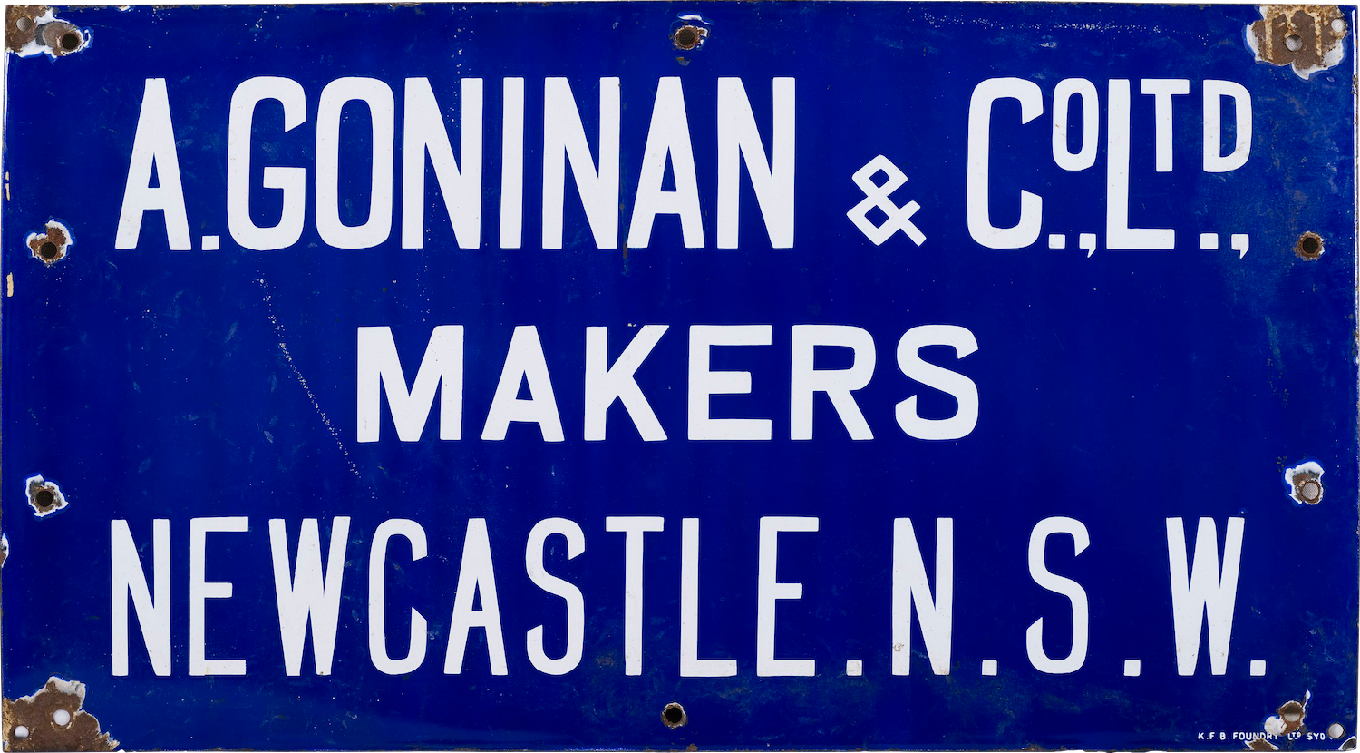
In a similar vein, the hand-painted maker’s sign for the overhead travelling crane in the Turbine Hall of the museum boasted an appealing irregularity and evidence of similar no-nonsense decision-making. The sharp terminals and distinctly reductive ampersand played off the more sober-minded letterforms, creating a haphazard but compelling impression.
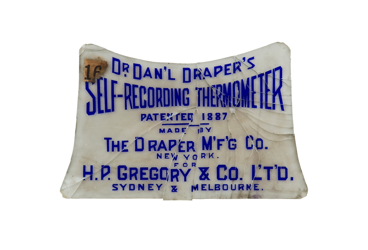
The detailing in seemingly incidental objects, such as this item plaque which accompanied a self-recording thermometer from 1887, also caught my eye. Proud, simplified capitals constructed with ruler and protractor communicate clear intentions, entirely practical and done with great care. It offered moments of surprising inventiveness as seen in the angled bowls of the P and R and the flat-topped ampersand.
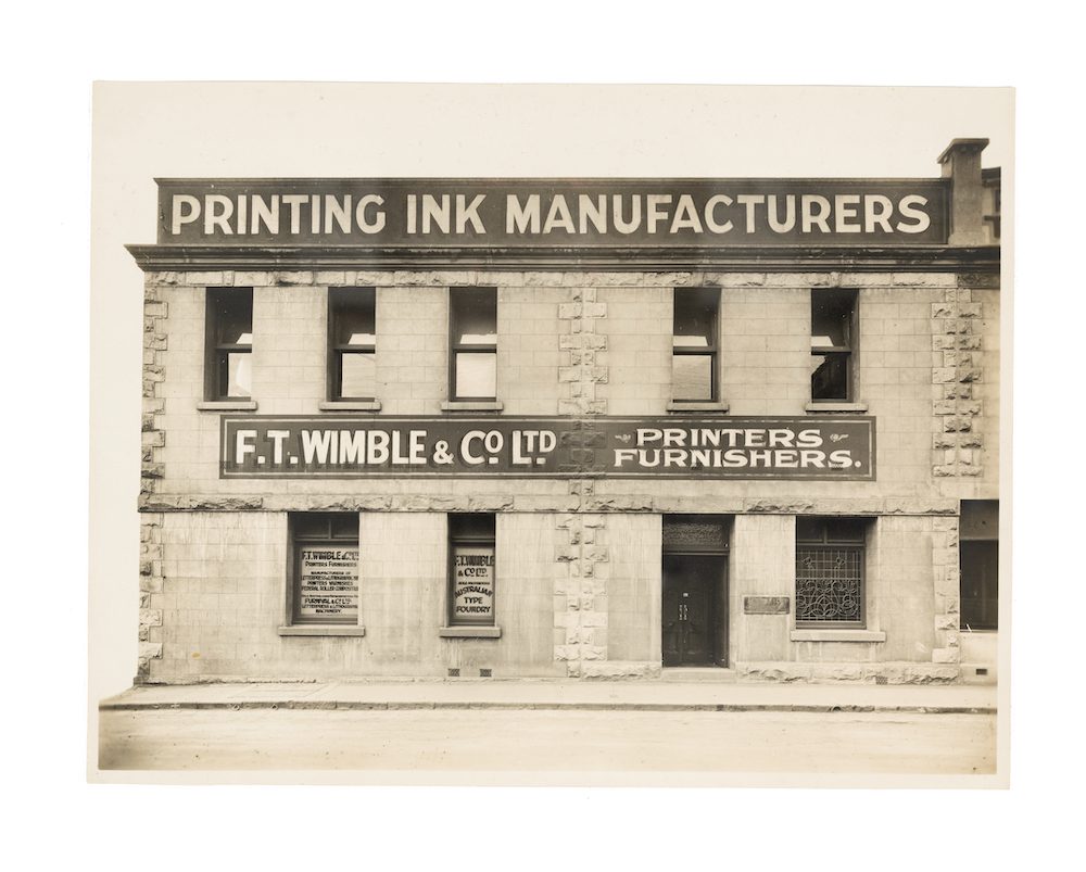
The richest repository of typographic reference however was a number of wood type specimens found in the F. T. Wimble Collection. The Powerhouse Collection boasts a significant array of documentation, business records and – to the author’s knowledge – the largest concentration of original type specimens from F. T. Wimble & Co., or the Australian Type Foundry, as it was known.
Frederick Thomas Wimble was an ink manufacturer, type founder, print furnisher and eventual politician. As part of a gift in 1995 from H. L. Wallace, who had acquired control of the company in 1975, three wood type specimens found their way into the Powerhouse Collection. The first two specimens, both anonymously titled No. 4 Catalogue of Superior Machine-Cut Wood Type, present letterforms imported from the Hamilton Manufacturing Company in Two Rivers, Wisconsin. They show a collection of anonymously-named, heavy, all-caps, condensed sans serifs with a few instances of slab serifs and chamfered sans serifs.
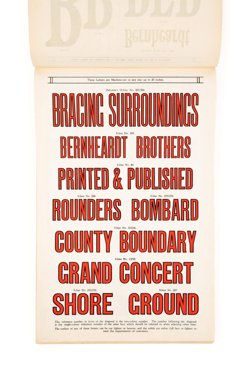
These two wood type catalogues were housed among several other Wimble specimens, while the third was discovered by Powerhouse archivist Paul Wilson. In remarkably good condition, the specimen (Book No. 27) presented the work of the DeLittle wood type manufacturer, dated about 1890. DeLittle was the last wood type manufacturer in England, operating from 1888 until 1998 and at its peak was supplying type to the Stephenson Blake foundry, one of the leading type foundries in the United Kingdom.
Inside, brilliant vermillion letterforms still dazzled on the page and impossibly compressed sans serifs – titled Elongated Sans – toyed with legibility by pushing the typographic genre to its very limits.
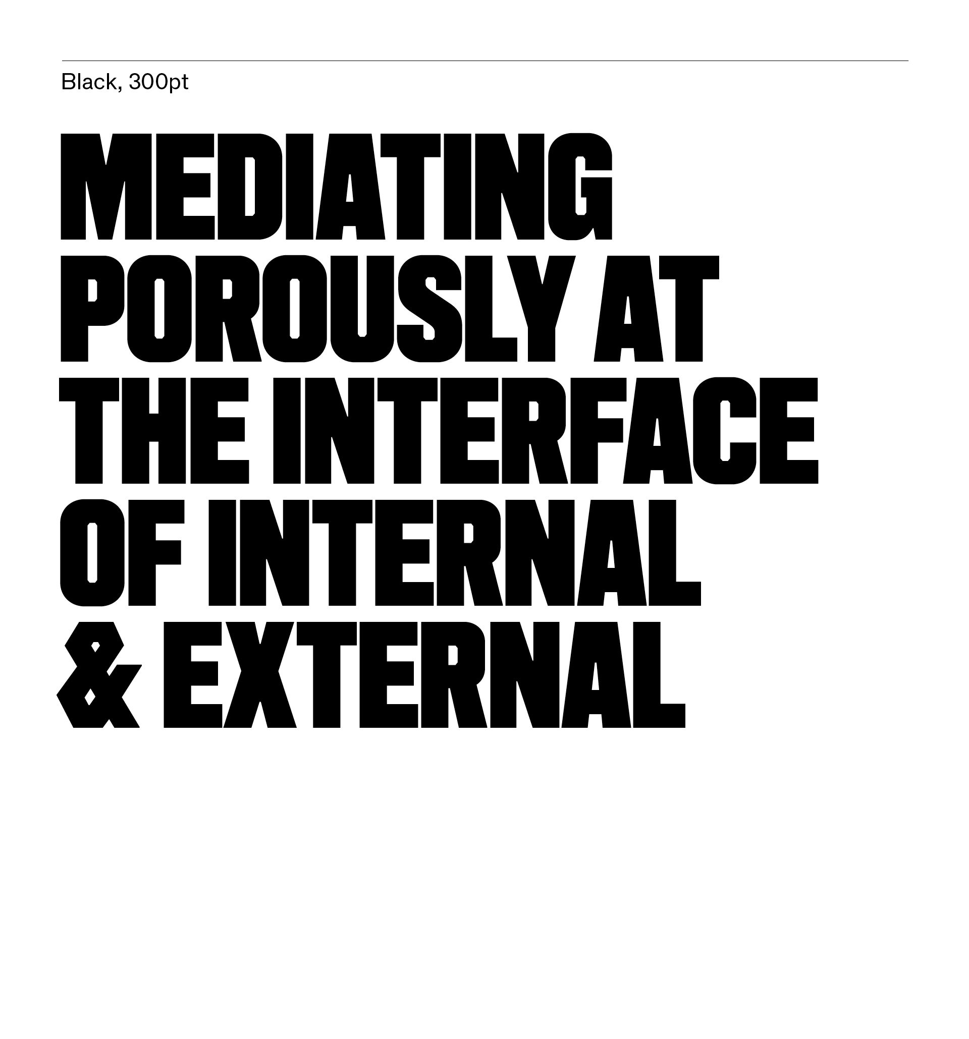
The resulting typeface was christened Powerhouse Cambium in consultation with artistic associate Agatha Gothe-Snape. Connecting wood type, timber and economic botany, the term is a reference to the ‘conduit tissue that is an interface between the inner core of the tree and its outer layers’. In a way, its deployment as the Powerhouse logotype operates in a similar manner, ‘mediating porously at the interface of internal and external’.
These additional wood type references helped inform the final typeface’s tone and timbre: embodying a self-assurance and strength while capturing a degree of individuality. Many of the diagonal junctures appear too heavy in both the Hamilton and DeLittle specimens. This can be attributed to the visual clogging that occurs where strokes meet. Initially, I attempted to adjust for this phenomenon, however later it became clear this quality gave the letterforms the honesty and physicality required. Inspired by the tram destination rolls, I also employed a kind of visual contradiction between counterform and exterior contour, allowing the exterior to wrap around a chamfered interior, a reversal of the logic found in the destination rolls. The broad, flat-topped bowls playfully contrast with the sharp punctuation and that iconic ampersand. There is a confidence in the final forms but also a kind of subtle awkwardness as it flirts with the tension between the accumulation of weight at junctures and typographic good taste.
Powerhouse Punctum
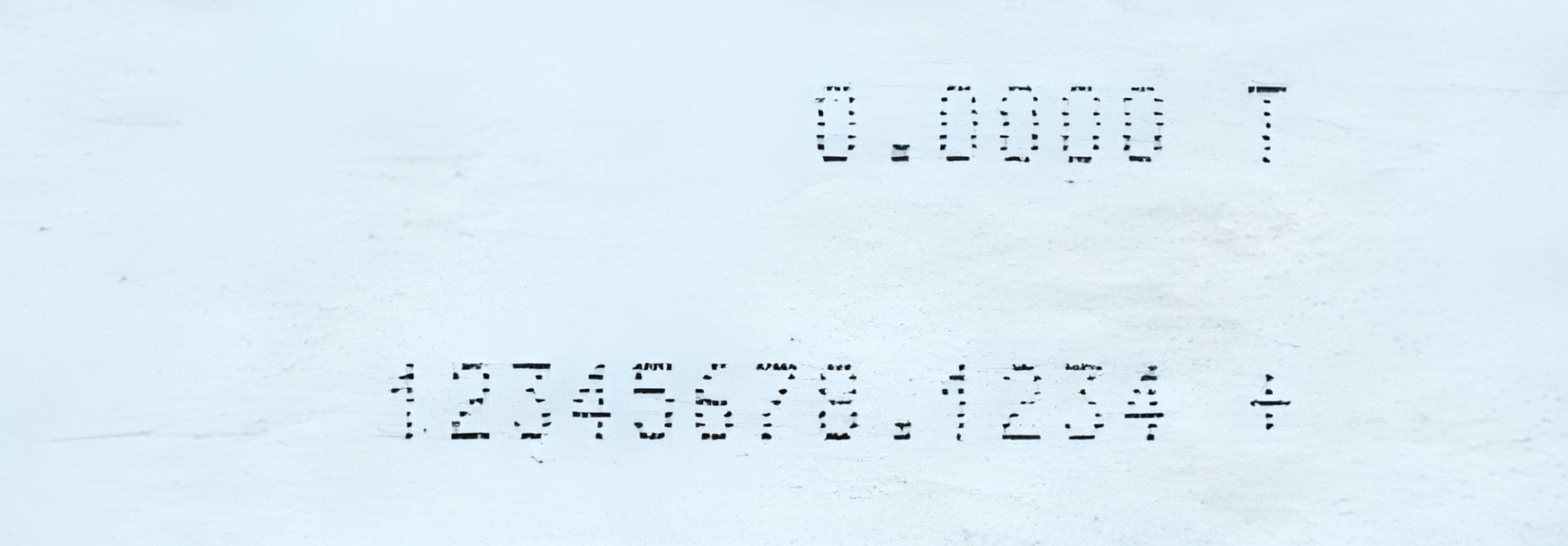
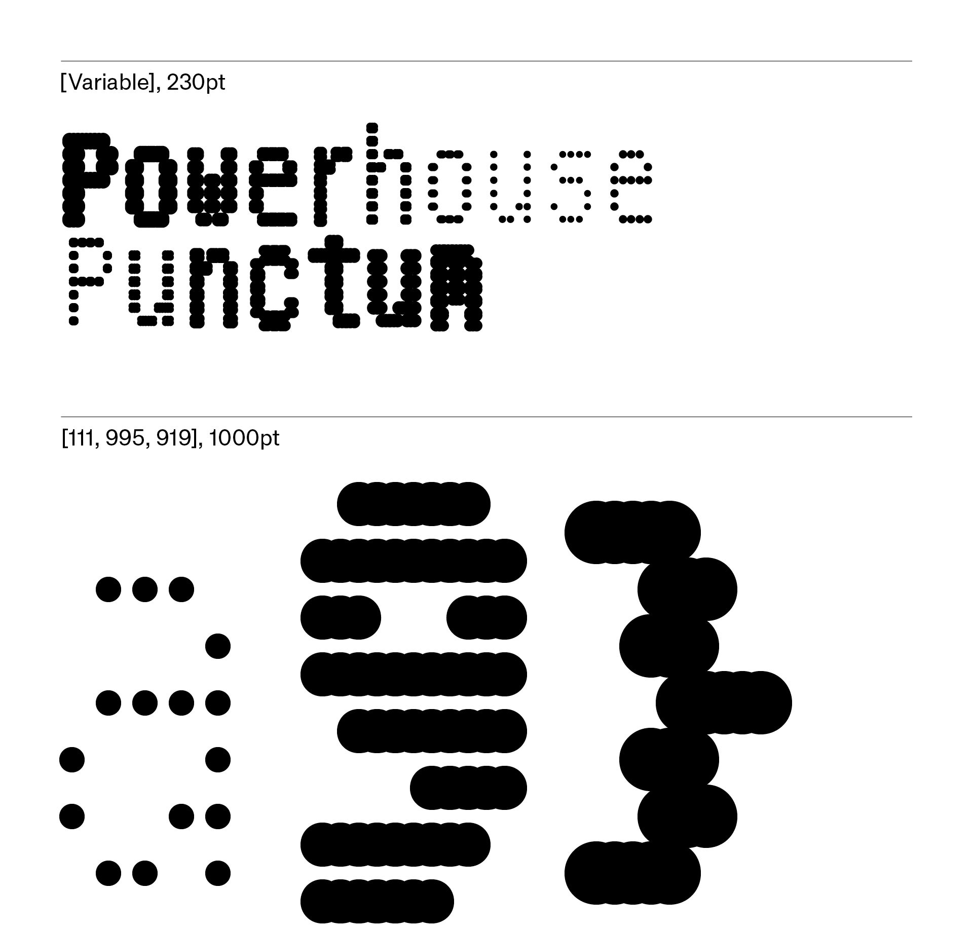
The second display typeface served an entirely different role. Offsetting the gravitas of Powerhouse Cambium, the palette called for something much more didactic. Studio Ongarato had made some preliminary drawings of a gridded, modular alphabet, calling to mind the vernacular of receipt printers and type borne of the constraints of early user interfaces, but it required grounding in the collection.
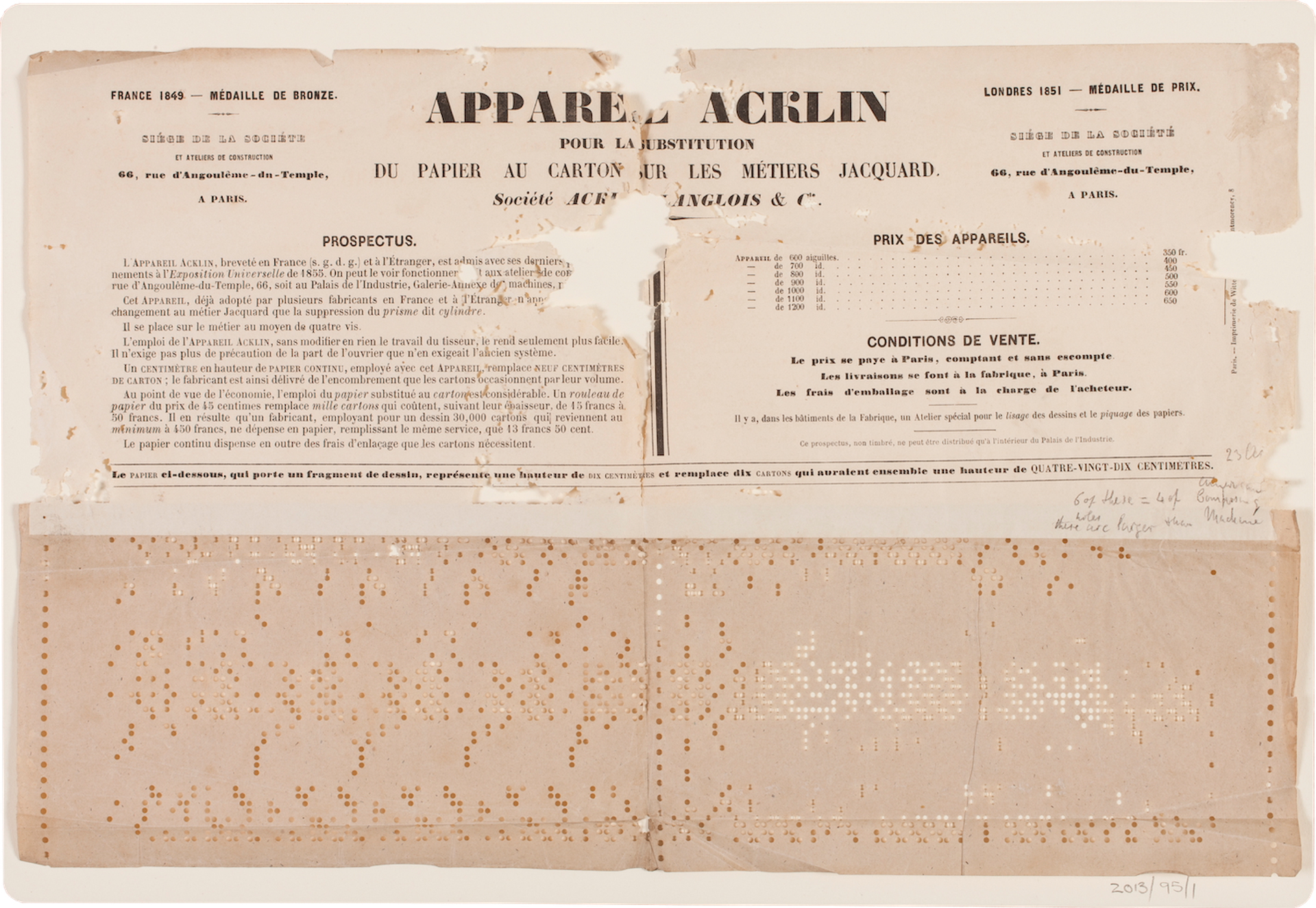
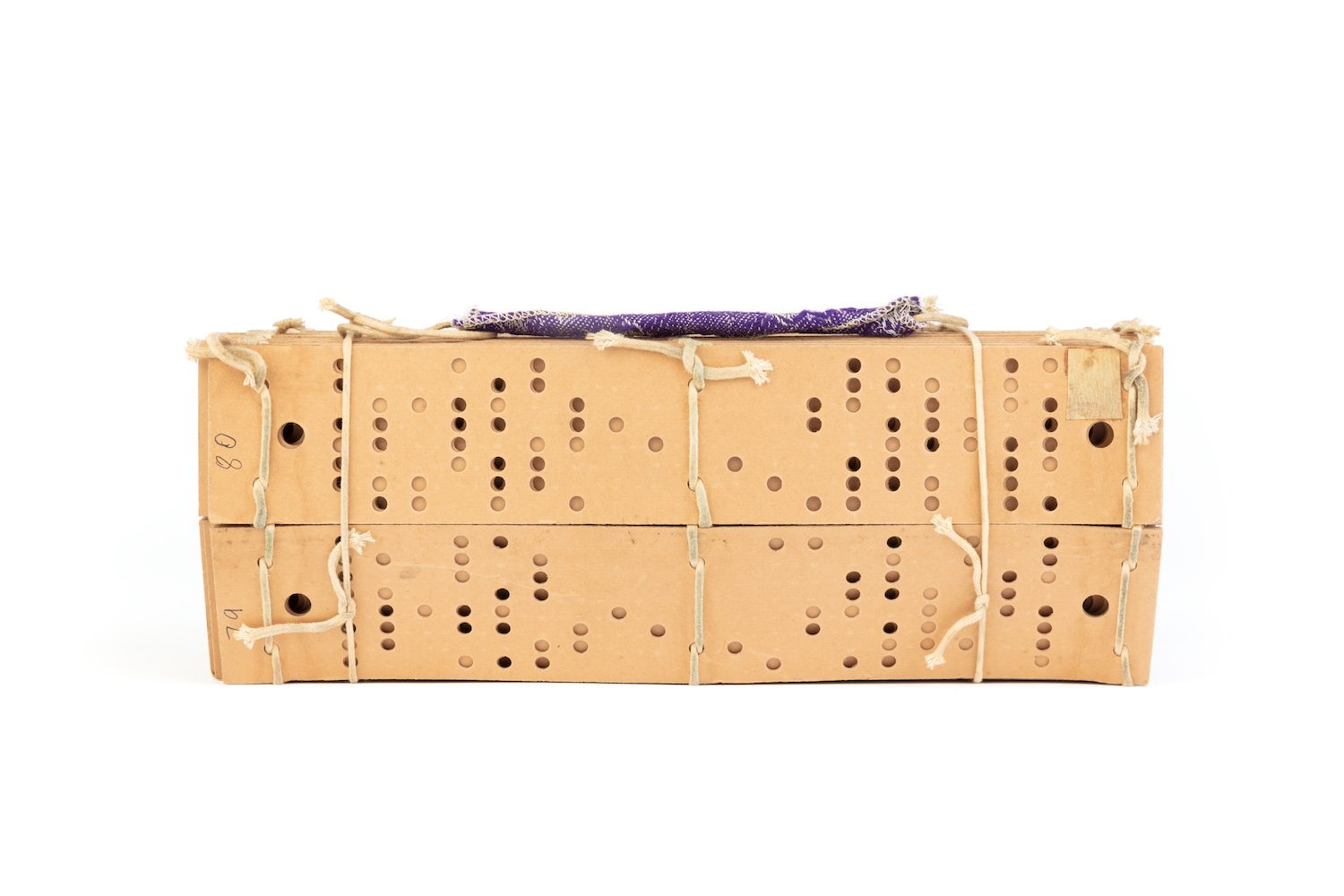
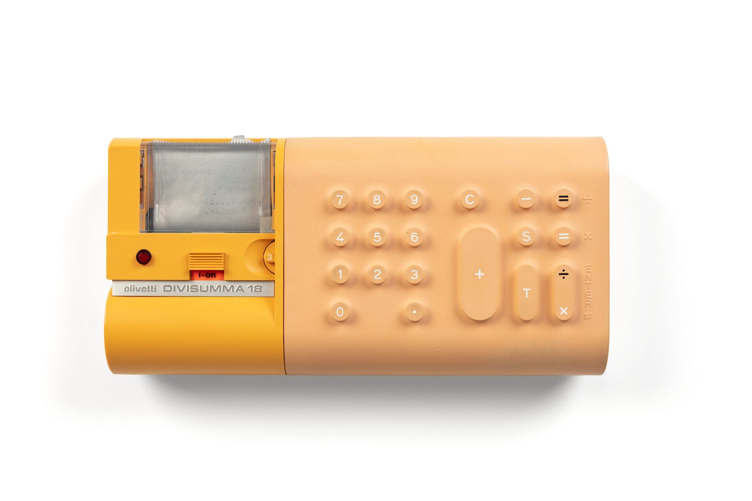
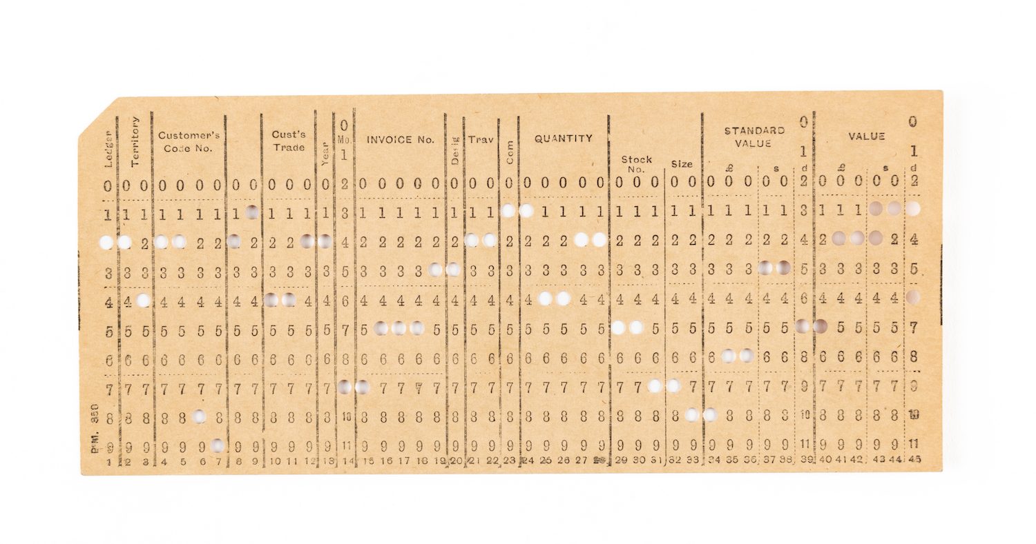
In speaking with curator Campbell Bickerstaff and director of Curatorial, Collections and Programs, Matthew Connell, I stumbled upon several points of departure. They ranged from the dot-matrix letters of an Olivetti Divisumma 18 portable calculator from (1973), to the punch cards for mechanical accounting machines (1955).
A particularly instructive moment occurred when I learned about a fragile punch card, discovered at the bottom of an archival box, containing letters of mathematician, inventor and mechanical engineer, Charles Babbage. The museum staffer stumbled upon a paper punch and prospectus for a Jacquard weaving machine, and in the lower right-hand section were scrawled some notes, most likely by Babbage himself. While he was developing his analytical engine, a precursor to modern computing, he realised he needed a way to send and store information economically and reliably. Upon seeing one of Jacquard’s automated looms, he immediately perceived the potential of this method and settled on the use of punch cards.
I found this artefact to act like a cypher, linking craft and code, the poetic and the rational. The second typeface, born of punches, pixels and dots, was asked to perform a similar task: it needed to speak of the aesthetics of data while allowing for something human at the same time. Informing this further I looked specifically for analogous moments in either nascent or transitioning technologies.
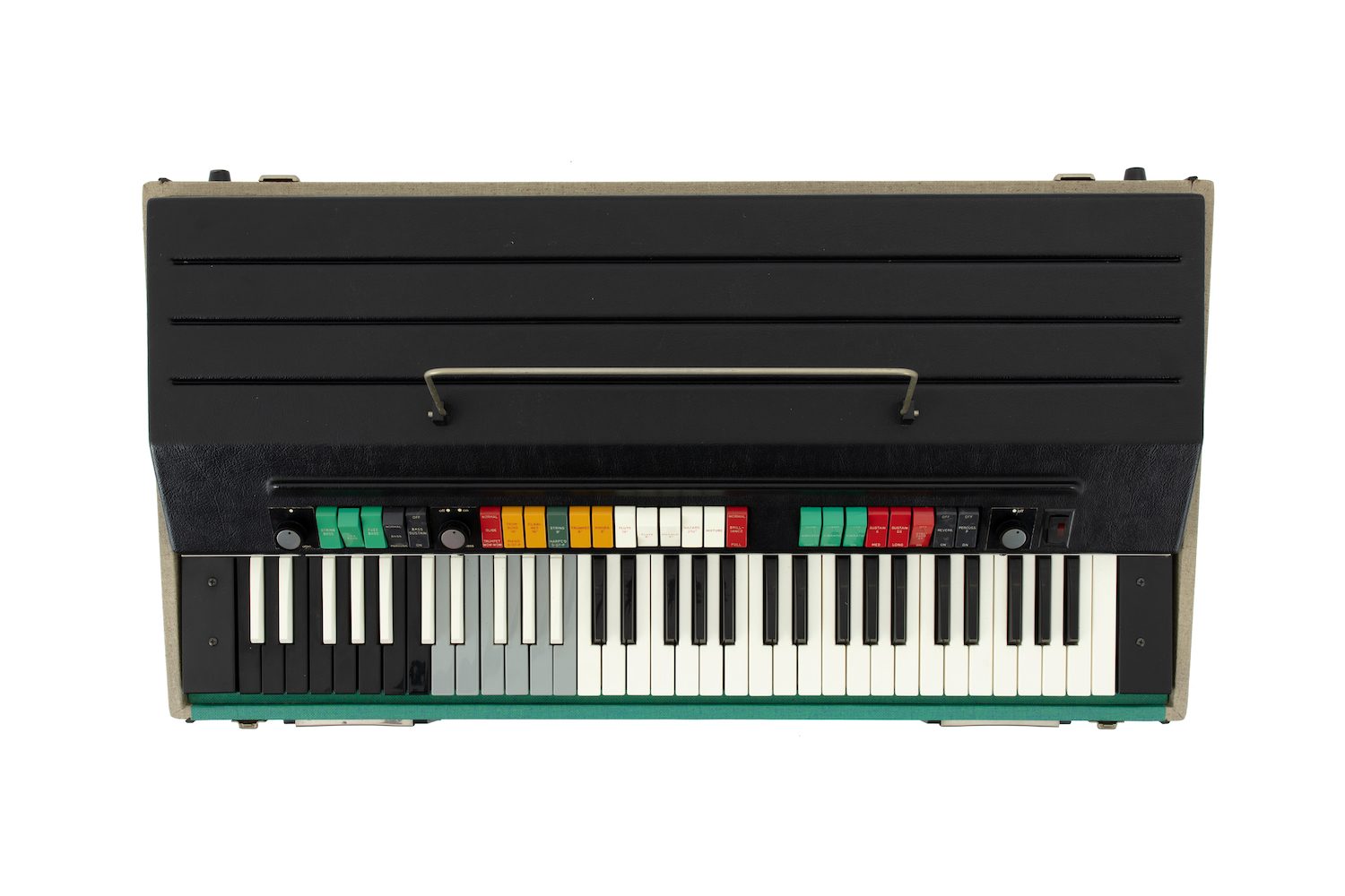
The exhibitions, Electric Keys and Interface: People, Machines, Design, both curated by Campbell Bickerstaff, proved useful here. A unique collection of early synthesisers and keyboards, acquired by Powerhouse in 2020, captures moments of great invention but also play. From their unapologetic colour schemes to the diagrammatic deployment of switches, dials, pedals and sliders, these phenomenal instruments allowed a multitude of sonic possibilities borne from the flirtation between great limitation and great possibility.
This quality is also evident in the way industrial design and applied art were thought of as one and same in visionary companies like Olivetti and Braun. In Olivetti’s Divisumma 18 Portable Calculator, we see evidence of architect and designer Mario Bellini considering not just function but the potential for emotive, even seductive form. By using anthropomorphic strategies – expressive clicks and a tactile plasticity under the fingertips – Bellini brought a human dimension to these everyday office machines.
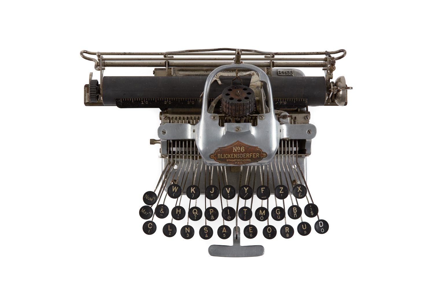
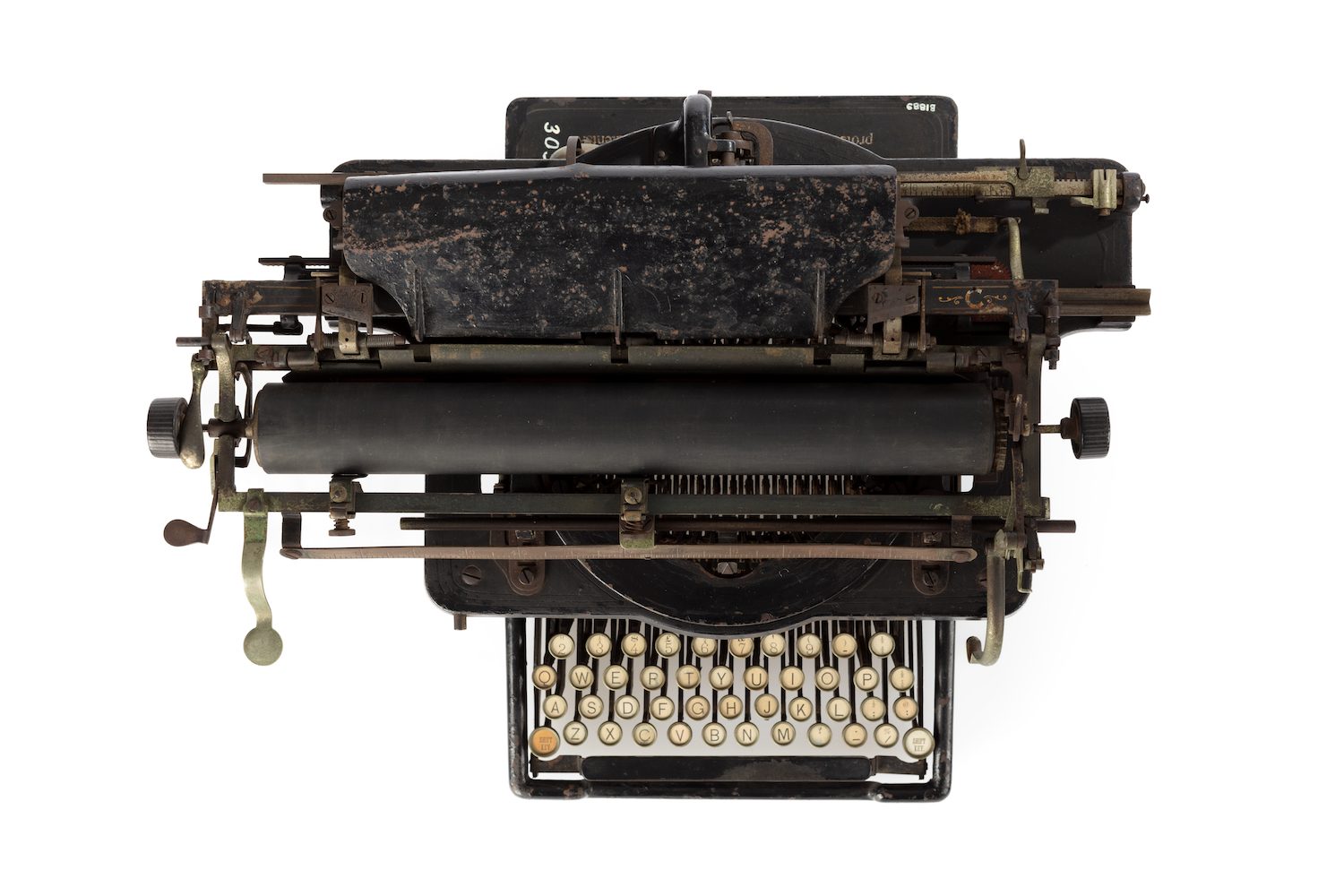
The Blickensderfer 6 typewriter similarly exhibits moments of embryonic innovation. One of the first truly portable typewriters, the intentional omission of a base and casing results in a pragmatically lighter machine but also creates its iconic hollowed, skeletal appearance. It also uniquely featured a cylindrical-type wheel rather than the more conventional-type bar architecture, a precursor to IBM’s famous golf ball mechanism.
What do early synthesisers and typewriters have to do with didactic letterforms? How does one translate their energy and avant-gardism into a typeface? In consultation with Studio Ongarato, I considered several grid constructions that would allow both legibility but also inventiveness in letterform construction. We settled on a 5 x 9 arrangement whereby the horizontal modules overlapped but the vertical modules remained spaced apart. This gave the glyphs a taller, narrower body but also created an unusual phenomenon whereby the fused horizontal strokes draw the eye across letterforms, a movement at odds with their verticality. Note the way the upper section of the ‘g’ and ‘y’ are way off the baseline to accommodate their descending tails.
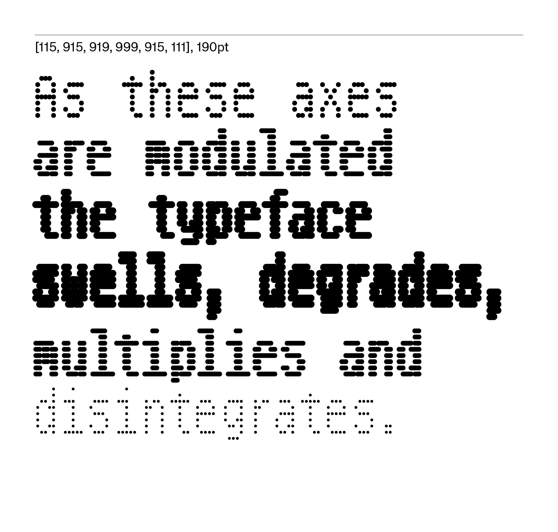
To inject some eccentricity to the typeface, we experimented with a number of variable axes allowing the letterforms to change stem width, module shape and module size. Referencing the synthesisers, we labelled these axes Pitch Bender, Transposer, Amplitude and, at one point, even considered a Noise axis, replicating the organic breaking down of the dots, like a worn punch unevenly inked.
The final typeface, titled Powerhouse Punctum, is a 12-font family with three discrete axes. As these axes are modulated, the typeface swells, degrades, multiplies and disintegrates, embracing the potential of puncture and porousness. In one breath it speaks to dot-matrix printers and low-resolution screens, but in another calls to reference coarse cross-stitch or the light-bleed of digital interfaces.
Powerhouse Filar
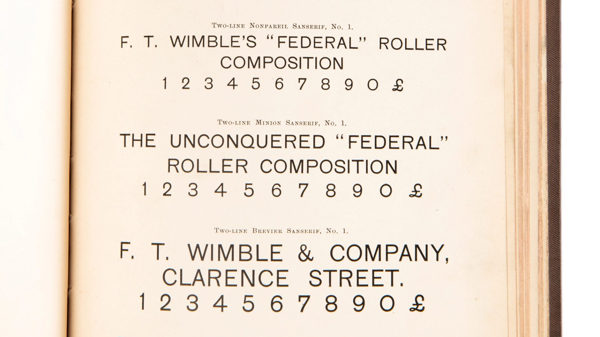
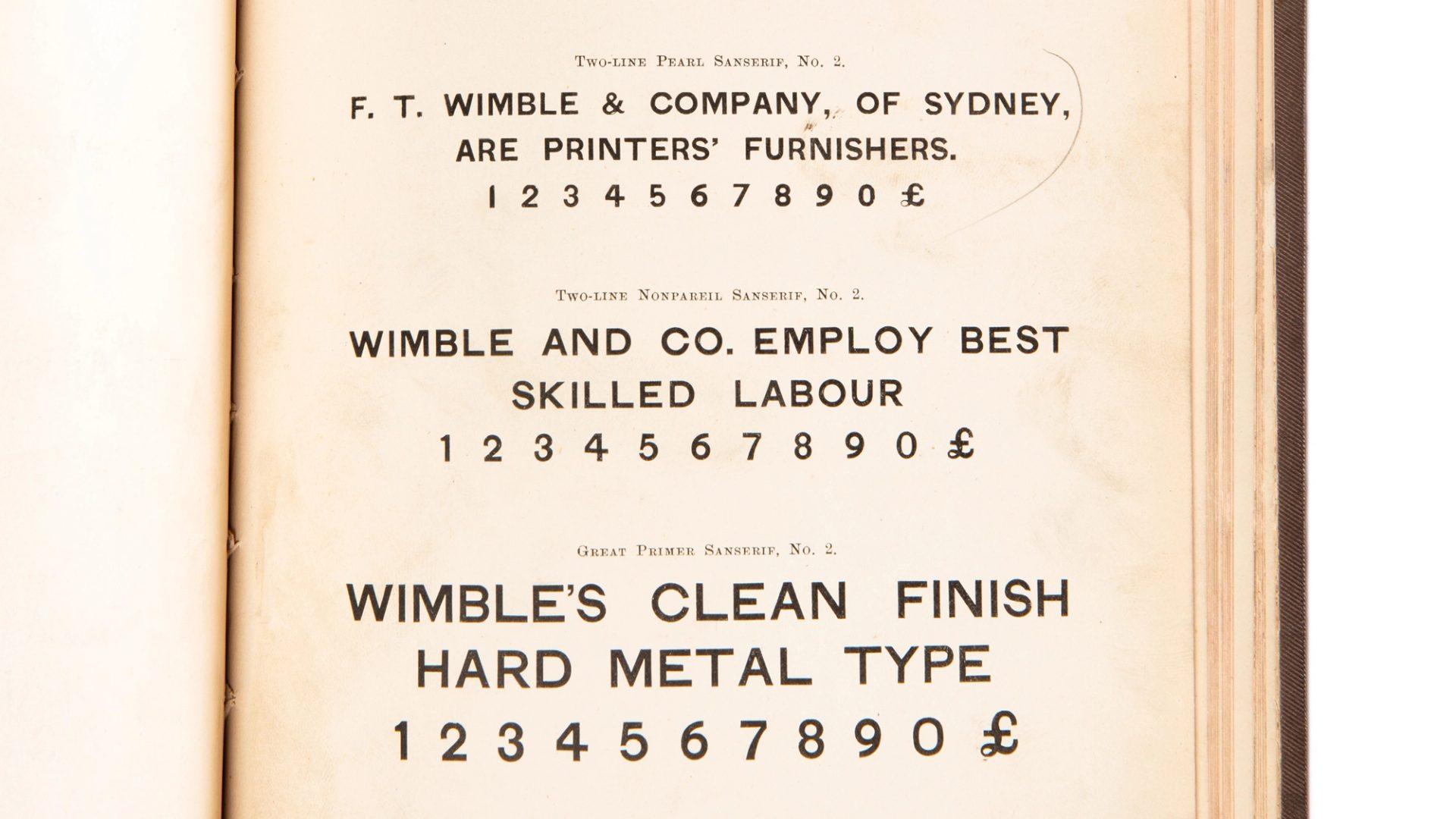
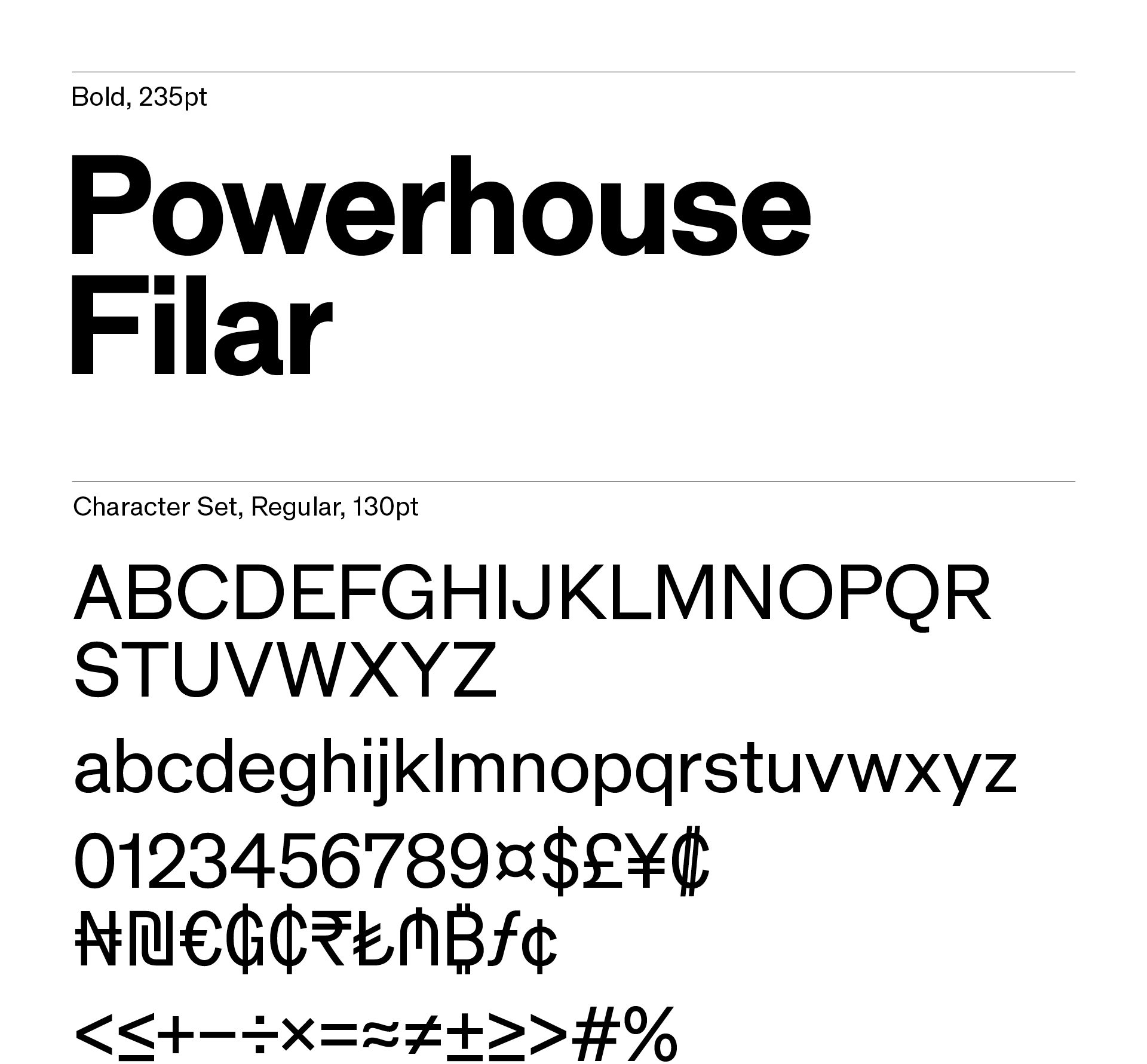
The third typeface needed to do the typographic heavy lifting: a jobbing face not primarily to be looked at but read. I returned to the Wimble Collection and pored through the metal type specimens looking for a letter that was largely quotidian but also exhibited a curious finish, contrast or proportion. Several fonts stood out to me, all anonymous in labelling and presence, namely Sanserif No. 1 and 2 and Gothic No. 1.
These generic faces were imported from British foundries such as Stephenson Blake and Miller & Richard and simply resold to the antipodean market. Over time as Wimble’s business grew and the foundry expanded to multiple locations in Australia and New Zealand, he began shamelessly rebadging fonts with local place names in an effort to bring a kind of national identity to the letterforms and give credence to his foundry. This may also have been a tactic to communicate a clear independence from its colonial forebears (think Bathurst Sans, Tasmania Expanded and Melbourne Gothic).
I was struck by the proud, stately capitals of Sanserif No. 2, also evident in Gothic No. 1. There were some unusual proportions and terminals I wanted to capture: the wide ‘L’ and ‘T’, the slightly softened angle on the leg of the ‘R’ and the varying terminals on the ‘C’ and ‘S’. In the final iteration there is a kind of polite nod to specific forms and finishes from these samples, but this is tempered with the practical needs of a workhorse grotesque.
To contrast this level-headedness, I added a unique approach to spacing largely inspired by the extensive collection of typewriters in the archive. Across four unitisation logics, the typeface moves from the even texture of a proportionally spaced font to one that employs only eight possible letter widths (Octo), four possible widths (Quarto), three possible widths (Trio) and finally a conventional monospaced font. This creates a curious spectrum between text with an even colour to something more like data, from letters to be absorbed to letters to be parsed.
The concept of unitisation is built into the historical development of typewriters as manufacturers wrestled with the mechanics of the carriage and platen. It is also inspired by a much earlier innovation called the Self-Spacing Type by Linn Boyd Benton in 1883. Benton sought to reduce the time it took to justify metal type by casting letters on a number of pre-determined widths. This enabled the compositor to justify a line of type much quicker, Benton boasting an ‘increase in composition speeds by 25%’.
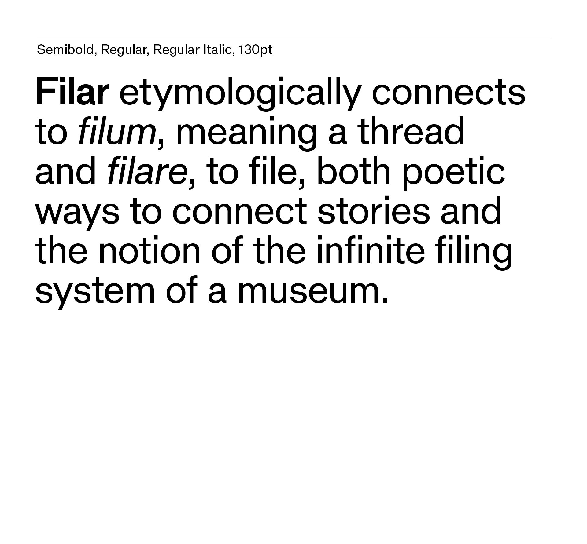
Finally, while the typeface varies in horizontal motion, it also employs a vertical constraint as a foil: the styles are duplexed, taking up identical space across its weight range. The resulting typeface is titled Powerhouse Filar and etymologically connects to filum, meaning a thread and filare, to file, both poetic ways to connect stories and the notion of the infinite filing system of a museum.
Powerhouse Filar is noteworthy among the three commissioned typefaces as it was intended the typeface not only be born of the archive but to join the archive as a collection item itself. By finding seeds in Wimble’s specimens and overlaying the horizontal spacing logic evident in the evolution of the typewriter’s typing mechanism, it demonstrates the ability to draw narratives rich and diverse across the Powerhouse Collection. It is a reflexive act that speaks to the museum’s ability to fold time. Furthermore, Powerhouse Filar is to be made available to the public as an open-source font. As a salve to institutional protectionism, the museum will encourage an organic growth of the typeface. This kind of radical accessibility aims to reinforce Powerhouse as a living, breathing, interactive and permeable institution.
The three typefaces lean on the significant breadth of the Powerhouse Collection and illustrate the potential to draw nuanced threads across seemingly unrelated domains. They employ a method that considers the ideas, intents and gestures underpinning the collection as cyclical or phasic, the embodiment of a perpetual continuum of human endeavours in all their beautiful fits and starts. The distinct materiality of their sources and the physical acts that bring them to life – carved, hewn and encoded – result in a typographic palette that reflects the expansive scope of the stories and objects that make up the renewed and redefined Powerhouse.
Identity Guidelines
The identity consists of a logotype with simple guidelines to ensure its best reproduction.
Powerhouse History
Powerhouse Museum has ‘always looked, Janus like, both backwards and forwards’. A museum is more than the physical container that holds it, it is everything that gets us to this moment.